the good, the bad, (and the ugly)
in this post we will discuss blueprint magazine.
i did not like the first issue. it contained worthless info that i had no use for. i have since warmed up some to it, but i have a major problem that i cannot get past: the editor.
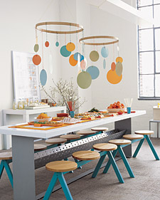
first some good to balance out the karmic schism i'm about to create: these mobiles from the baby shower in the new issue are made from construction paper and embroidery hoops. that's creative and good looking. kudos.
 these mobiles from the baby shower in the new issue are made from construction paper and embroidery hoops. that's creative and good looking. kudos.
now, for the bad = trying to read ANYTHING written by the editor beast, Sarah Humphreys.
for example:
"Editor-in-chief Sarah Humphreys moved into a cozy (okay, claustrophobic) apartment. Stumped by her pressing problems, she talked (okay, complained) about them at work, all the time.
The home editors, in a moment of selfless generosity (or utter exasperation?), volunteered to work their magic on her itty-bitty abode, and dreamed up a slew of impressive solutions."
in three sentences, she uses a parenthetical in every one of them. 3 out of 3. that's 100% of her sentences. its impossible to read - it makes my head hurt.
you're thinking maybe i just picked the only crappy sentence in the article. but nO. they're all that way:
"One reason for the mishmash: I purchased the white Ikea sofa and oversized chair I'm sitting on from the woman who lived in the apartment before me, since I was (rightfully) doubtful that my own sofa would fit in the space (it wouldn't have even made it through the front door). In addition, the walls were painted a bland butter color (affectionately dubbed masking-tape yellow' by Page), which made the apartment dark, and therefore even more confining and cavelike."
two sentences -- three of them!!! where did she learn to write like this? i have to assume that martha was in jail when they made her editor?
and its not just this issue. its every month! every freaking month i have to try to decipher some meaning from what this woman is trying to say as she barrages me with statement after not clever statement put in PARENTHESIS. (just use a comma!)
(and i don't really mean ugly, it just made for a good post title - she's actually pretty cute i guess)


8 comments
i received a couple of free trial issues of blueprint, and i agree. although they had SOME cute ideas and neat stuff, it felt "incomplete" in some ways. hopefully it will get better, but the preview issues didn't do much for me.
ReplyDeleteher writing style is something that would be spoofed on SNL. is that for real? how is she gainfully employed?
ReplyDeletei would have serious doubts about the quality of the overall publication if they chose a creative writing dropout as their editor.
I love a good grammar rage in the morning!
ReplyDeleteoh, and nothing wrong with a little badonkadonk! :)
ReplyDeleteExtremely annoying (and rightfully so)...especially when there are about 785,604 (rought estimate) people out there (in the world) who could do her (seemingly) perfect job better (probably) than her.
ReplyDeletenow see, this is what i'm talking about. i tend to focus on the visual. i'm not a great writer, i don't follow any rules. but i don't call myself an editor and martha stewart hasn't ever hired me based on my so called skill set.
ReplyDeletethis was again, one of their silly attempts at trying to sound conversational, all 'girlfriend'ish.
sort of like when oprah breaks in to, home-girl ebonix. it's cringe inducing
I hate her ass face. And why are editors of shelter magazines allowed to have totally style-less, bogus apartments? How are they deserving of their jobs?
ReplyDeleteha!
ReplyDelete